

Unité D'habitation - Le Corbusier - Marseille
The Unité d'habitation Housing Unit) is a modernist residential housing design principle developed by Le Corbusier, with the collaboration of painter-architect Nadir Afonso. The concept formed the basis of several housing developments designed by him throughout Europe with this name. The most famous of these developments is located in south Marseille and was built between 1947 and 1952.
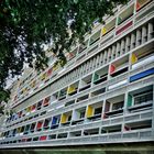
The Marseille building, developed with Corbusier's designers Shadrach Woods and George Candilis, comprises 337 apartments arranged over twelve stories, all suspended on large piloti. The building also incorporates shops with an architectural bookshop,[5] a rooftop gallery, educational facilities, a hotel which is open to the public,[6] and a gastronomic restaurant, Le Ventre de l'architecte ("The Belly of an Architect").
Inside, corridors run through the centre of the long axis of every third floor of the building, with each apartment lying on two levels, and stretching from one side of the building to the other, with a balcony.
Unlike many of the inferior system-built blocks it inspired, which lack the original's generous proportions, communal facilities and parkland setting, the Unité is popular with its residents and is now mainly occupied by upper middle-class professionals.
The flat roof is designed as a communal terrace with sculptural ventilation stacks, a running track, and a shallow paddling pool for children. There is also a children's art school in the atelier. The roof, where a number of theatrical performances have taken place, underwent renovation in 2010 and since 2013 it hosts an exhibition center called the MaMo. The roof has unobstructed views of the Mediterranean and Marseille.
Commenti
2


Informazioni
| Sezione | Motive: Hochhäuser |
| Cartelle | France |
| Visto da | 2.700 |
| Pubblicato | |
| Lingua |

|
| Licenza |
Exif
| Fotocamera | X20 |
| Obiettivo | --- |
| Diaframma | 2.2 |
| Tempo di esposizione | 1/850 |
| Distanza focale | 7.1 mm |
| ISO | 200 |
Inserire la foto in un'altra pagina
Aggiungi il seguente link in un commento, una descrizione o un messaggio per inserire questa immagine.
Link copiato...
Clicca sul link e usa i tasti "Strg C" [Win] oppure "Cmd C" [Mac] per copiare il link.
Condividi su Messenger
Inserisci il seguente link nel campo commento della conversazione desiderata su Messenger utilizzando 'Incolla' per inviare questa immagine nel messaggio.
Link copiato...
Clicca sul link e usa i tasti "Strg C" [Win] oppure "Cmd C" [Mac] per copiare il link.
JayTom 08/07/2018 12:12
Viele, viele kleine Rechtecke und zwei große Dreiecke - der Bildaufbau gefällt mir sehr. Ungewöhnlich die Ausrichtung des Gebäudes, doch sie ist sehr förderlich für den Bildeindruck.Du hast das Bild sicher nicht so (überwiegend grafisch) gesehen wie ich es sehe und gerade beschrieben habe. Denn dafür wäre eine Schwarzweißbearbeitung besser gewesen, die Farben lenken eigentlich nur ab.
Gruß, Jörg