

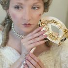
Madame Pompadour 2
Another from the same theme collection.
Commenti
4


Informazioni
| Sezione | People: Portrait |
| Visto da | 3.979 |
| Pubblicato | |
| Lingua |

|
| Licenza |
Inserire la foto in un'altra pagina
Aggiungi il seguente link in un commento, una descrizione o un messaggio per inserire questa immagine.
Link copiato...
Clicca sul link e usa i tasti "Strg C" [Win] oppure "Cmd C" [Mac] per copiare il link.
Condividi su Messenger
Inserisci il seguente link nel campo commento della conversazione desiderata su Messenger utilizzando 'Incolla' per inviare questa immagine nel messaggio.
Link copiato...
Clicca sul link e usa i tasti "Strg C" [Win] oppure "Cmd C" [Mac] per copiare il link.
Thomasina Leigh 04/05/2006 21:46
The first thing is, what is she holding? Too near the colour of the nails. Again great lips. I suggest another big crop. A drastic crop! Leave just the lips, beauty spot, and close crop to the little finger on her right hand. Again use layers on PS, sharpen the lips, and muck around with levels, exposure, sharpness, noise etc. You will come up with easily what you want, because the basics are there.Jeff Burgess 30/04/2006 6:16
nice, and I agree with above. How about a dark red or black background.Rob Brydon 30/04/2006 1:43
Nice work Glo with the nails and the image. I can appreciate the effort involved in both. The only suggestion from me is in agreement with Ruud about the contrast, especially in the background..Cheers..RobRobert van der Sanden 29/04/2006 18:26
Another nice one although I like the first one more. I find the lighting on the hands a bit flat and the way she holds her upper hand with the streched fingers give it a tension. A bit looser would go better with the softness of the rest of the picture.