
Commenti
37


Informazioni
| Sezione | Natur: Enten, Gänse, Schwäne |
| Cartelle | tierisches |
| Visto da | 3.801 |
| Pubblicato | |
| Lingua |

|
| Licenza |
Preferite pubbliche

Inserire la foto in un'altra pagina
Aggiungi il seguente link in un commento, una descrizione o un messaggio per inserire questa immagine.
Link copiato...
Clicca sul link e usa i tasti "Strg C" [Win] oppure "Cmd C" [Mac] per copiare il link.
Condividi su Messenger
Inserisci il seguente link nel campo commento della conversazione desiderata su Messenger utilizzando 'Incolla' per inviare questa immagine nel messaggio.
Link copiato...
Clicca sul link e usa i tasti "Strg C" [Win] oppure "Cmd C" [Mac] per copiare il link.
Piet K. 22/12/2010 21:26 Commento di voto
KontraMoJo Rising 22/12/2010 21:26 Commento di voto
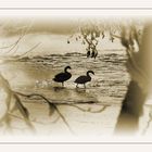
-das Motiv hat an sich schon was, aber die Weißvignette, der Rahmen und die gelbbraune Tonung sind zu viel des Guten. Außerdem wirkt es leicht überschärft in den Wellen.
Sorry,
LiGrü Mo
limited edition 22/12/2010 21:26 Commento di voto
-
ninon68 22/12/2010 21:26 Commento di voto
cRolf Brüggemann 22/12/2010 21:26 Commento di voto
c..findus. 22/12/2010 21:26 Commento di voto
cEnrico Mevius 22/12/2010 21:26 Commento di voto
-Jo P aus K 22/12/2010 21:26 Commento di voto
cNielsson 22/12/2010 21:26 Commento di voto
... hätte man auch anders machen können: z.b. ohne weichzeichnung/weißes gedöns, rahmen, sepia. so halte ich es für kitsch. contra.Rollfilm 22/12/2010 21:26 Commento di voto
-Herr M 22/12/2010 21:26 Commento di voto
-Marion Vollborn 22/12/2010 21:26 Commento di voto
-Maiarisli 22/12/2010 21:26 Commento di voto
Wunderbar fürs aug und eben ProSabine Onken 22/12/2010 21:26 Commento di voto
-Arno M 22/12/2010 21:26 Commento di voto
nein...