

35/18
Riva Trigoso
Commenti
5


Informazioni
| Sezione | Temi: Criticatemi! |
| Cartelle | la città che vorrei |
| Visto da | 4.155 |
| Pubblicato | |
| Lingua |

|
| Licenza |
Exif
| Fotocamera | DMC-GX8 |
| Obiettivo | --- |
| Diaframma | 8 |
| Tempo di esposizione | 1/400 |
| Distanza focale | 26.0 mm |
| ISO | 100 |
Hanno messo mi piace


Inserire la foto in un'altra pagina
Aggiungi il seguente link in un commento, una descrizione o un messaggio per inserire questa immagine.
Link copiato...
Clicca sul link e usa i tasti "Strg C" [Win] oppure "Cmd C" [Mac] per copiare il link.
Condividi su Messenger
Inserisci il seguente link nel campo commento della conversazione desiderata su Messenger utilizzando 'Incolla' per inviare questa immagine nel messaggio.
Link copiato...
Clicca sul link e usa i tasti "Strg C" [Win] oppure "Cmd C" [Mac] per copiare il link.
Ulrike Purz 24/02/2018 9:50
Wo baust Du diese Häuser?Immer wieder hervorragend!
Ulike
Sigrid Warnke 23/02/2018 20:31
Grafisch und farblich ganz hervorragend.LG Sigrid
ShivaK 23/02/2018 17:10
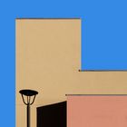
very good one regarding colors and cut, but I would have avoided to have the third line from the bottom touching the end of the mast. But maybe this is exactly what you wanted ;-)Fernando Anzani 23/02/2018 14:58
Questa prospettiva ortogonale dà a questa foto un surplus eccezionale, per non parlare poi delle geometrie e delle cromie. Bellissima. Ciao. Fernando.Stephan Rückert SR 23/02/2018 13:51
Sehr fein!Liebe Grüße von Stephan